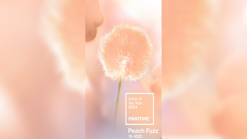
Pantone Color of the Year, Peach Fuzz
What is PANTONE 13-1023 Peach Fuzz?
“PANTONE 13-1023 Peach Fuzz captures our desire to nurture ourselves and others. It’s a velvety gentle peach tone whose all-embracing spirit enriches mind, body, and soul. In seeking a hue that echoes our innate yearning for closeness and connection, we chose a color radiant with warmth and modern elegance. A shade that resonates with compassion, offers a tactile embrace, and effortlessly bridges the youthful with the timeless.” – Leatrice Eiseman, Executive Director, Pantone Color Institute
https://www.pantone.com/color-of-the-year/2024
A light, delicate shade that sits between pink and orange, Peach Fuzz marks the 25th anniversary of Pantone’s Color of the Year program. This soft, heartfelt hue expresses the desire to nurture kindness, compassion, and connection—all while fostering a deep coziness as we seek a peaceful future.
The History of Pantone Color of the Year
The history of the Pantone Color of the Year dates back to the year 2000 when the Pantone Color Institute introduced this annual tradition. Pantone, a renowned color matching system widely used in various industries, decided to designate a specific color each year that reflects the prevailing cultural, social, and design trends. The chosen color serves as a symbolic representation of the collective mood and influences diverse fields such as fashion, design, and art. Over the years, the Pantone Color of the Year has become an influential and anticipated announcement, eagerly awaited by designers, marketers, and creatives worldwide. The selection process involves a careful analysis of global influences, including fashion, art, travel, technology, and socio-economic conditions. Each chosen color is intended to convey a message and evoke emotions, shaping the visual landscape of the year to come. The Pantone Color of the Year has not only become a trendsetter but also a reflection of the evolving cultural zeitgeist.
Sherwin Williams, Color of the Year, “Upward”
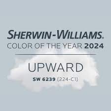
A HINT OF SILVER LINING
Introducing Upward, a breezy, blissful blue. The color found when we slow down, take a breath, and allow the mind to clear. Sherwin-Williams looked to the skies to source its 2024 Color of the Year. Upward is a soft and beautiful blue, imbued with slight red undertones, a hint of gray, and some of the natural attributes we associate with green. Evocative of Scandi slow living or coastal vibes depending on its application, Upward is an asset for anyone looking to create a calming contrast from the busyness of modern life.
https://www.sherwin-williams.com/en-us/color-of-the-year-2024
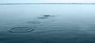
Dunn Edwards, Color of the Year, Skipping Stones
Similar yet distinct from Sherwin-Williams’s Upward, Skipping Stones takes its cues from the sea rather than the sky. Described by Dunn-Edwards color expert Deming Carpenter as “a perfect bridge between warm and cool,” this moody, meditative blue is a welcome addition to an interior, whether it appears on cabinets, all four walls, or more subtle applications. It’s also right at home alongside the other nature-inspired colors of the New Dawn collection, part of the brand’s broader 2024 Color + Design Trends selections.
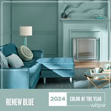
Valspar, Color of the Year, “Renew Blue”
Can’t decide between the greens of today or the blues of tomorrow? Renew Blue, Valspar’s 2024 Color of the Year, rejects that false binary. As the name suggests, this blue is all about restoring equilibrium and recharging, managing to feel peaceful yet provocative. Whether grounded with help from neutrals like Perfect Backdrop and Dusk in the Valley or standing out on its own, there’s no doubt that Renew Blue has what it takes to help your home feel like a space for getting in touch with your true colors.
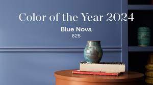
Benjamin Moore, Color of the Year, “Blue Nova”
Benjamin Moore’s Blue Nova is another mid-toned blue that balances the warm with the cool. Andrea Magno, the brand’s color marketing and development director, describes Blue Nova as a “captivating, otherworldly” color that captures the spirit of twilight to achieve something magical. As a matte finish, Magno appreciates its ability to introduce a “velvety feel,” but it’s also got the versatility to add an air of approachable excitement to kitchen islands, cabinetry, and even front doors.
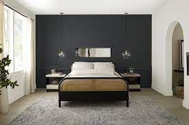
Behr, Color of the Year, “Cracked Pepper”
Behr’s top pick for 2024 goes boldly back to black at a time when brighter near-neutrals would seem to rule the day. A luxe charcoal tone, Cracked Pepper proves that even a darker color can feel soft, cozy, and comfortable while still making a statement. Whether used as an anchor in a modern space or as feature of something more classic, there are plenty of reasons why this top seller in Behr’s Designer Collection Palette is worthy of its Color of the Year status.
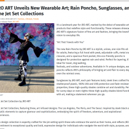
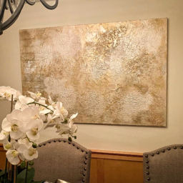
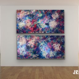
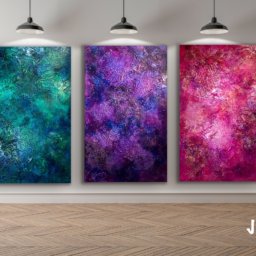
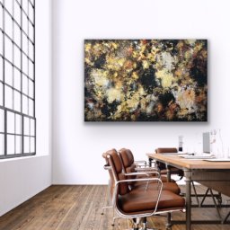
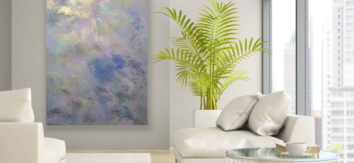
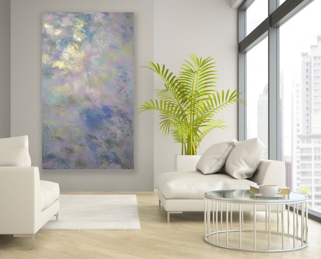
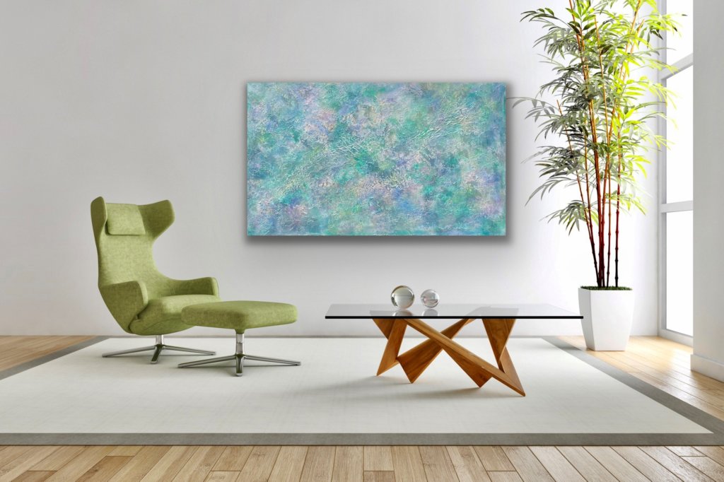
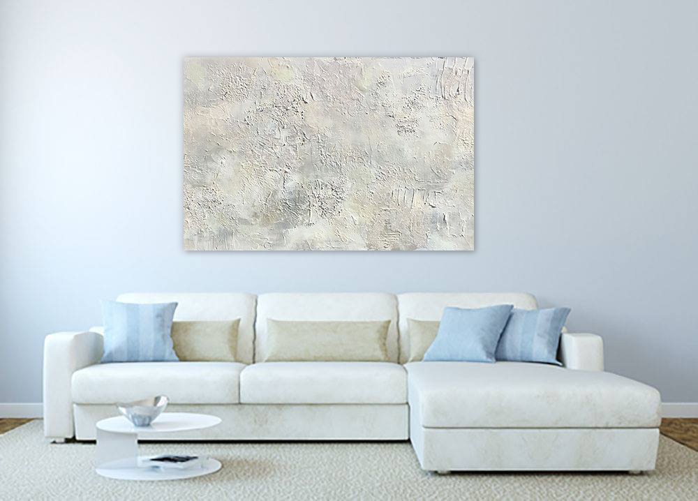
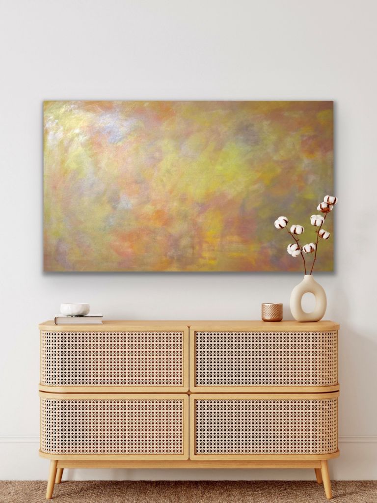
JENNIFER RAE OCHS, CONTEMPORARY ONE OF-A-KIND PAINTINGS
Jennifer Rae Ochs bears witness to the world and herself, rendering the complexity of both in vibrant abstraction. A celebrator of life, JRO illustrates her story with color and texture. Her body of work is a wild confessional tethered by the truth of her experience and the discipline of her craft. JRO creates a visual story grounded in reality and spirited by possibility.
JRO is a gifted visual artist who creates in several mediums. At the heart of JRO’s work are mixed media and acrylics on canvas. JRO’s original artwork is timeless, elegant, light interactive, and expressionistic, incorporating hundreds of mixed media /acrylic layers. With expertise in custom-commissioned statement art, her one-of-a-kind, site-specific paintings are enjoyed by art collectors globally.
The fine artist indulges her passion for design, multimedia creation, adventure, and travel alongside her dedication to the study of classical piano. Jennifer has been based in Los Angeles since 2000. She now divides her time between the LA studio and travels for her art exhibition tours. JRO’s work can be seen domestically and internationally at art festivals, galleries, and museums.
I’m currently experiencing some spontaneous and inspired thoughts, here’s a few …
View Our Collections
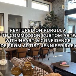
CUSTOM STATEMENT ART, JRO ART
“Each custom project is an honor, a new experimental adventure to shake things up with a renewed intention to create one-of-a-kind uniqueness in harmony with the collector’s environment, bringing forth the Spirit
of the Space.” – Jennifer Rae Ochs
Manifesto by JRO ART
Galloping horseback. Pursued by a wild bull at 17,000 feet elevation; I’m just 2 hours South of Quito. Entranced by the Andes, at full stride I ascend the eastern flank of the Parque Nacional Cotopaxi. My windstorm of momentum is halted by the contact with intimate eyes that suspend me deep in my creative conscious. The pack of wild horses spooked and I gave chase to indulged enticement. This is why I create.
My work is a celebration of moments in time. I revel in conflict amid conviction. Resolution is found in the creative process. Texture becomes solution, color stages revolution. Raw emotion invites me to the canvas. Strokes are felt long after the brush is laid to rest. I check the canvas for a pulse and dig the vibrations.
I was three when my first love arrived. I watched in awe not knowing that the medium grand Wurlitzer was to be mine. Classical piano, my first creative outlet offered a source of technical movement. My musical study creates freedom and balance in my artwork. My love for the masters taught me to transcend technique, and expand my vision of expression. Like painting playing piano is a catalyst to the sensual world. Both disciplines demand the five senses attention, as I relate; sound to color, passion to movement, and reaction to process.
The personal vs. universal truth is discovered in culture, realized in travel and developed in the necessary love that is free will. The world is an infinite canvas open and waiting. The complexities of illumination vs. exploration are rendered in strokes as I travel the globe. These unique people of our shared world resonate.
And my heart was captured by my third love… Painting for me is not an exercise in randomness but rather an endeavor to shine light. I am interested in things that are beautiful, aesthetic delights. During the creative process, I focus on the impact of experience; less interested in the aggregate truth. I rarely approach the canvas with a sense of direction, rather I understand illumination can exist over time, and the movements forward reveal my history. In my constant state of communication, complex textures emerge. Pursuit creates momentum and yields revelation. I appreciate the structure of time and celebrate disorder.
The living power of art is humanity. It arouses and confounds. Each canvas a magnetic pull to the beings, the forces of nature that shift perspectives and create new realities, for this journey I thank you. Witnessing the discovery of my work by another who feels my passion and desires to possess it, bathes me in moonlight. You are my friends, my collectors, my spheres of influence and I am honored.
To my muse, who afford me a glorious space in time. You are the angels I have encountered, and those yet to be revealed. I treasure the holistic relationship we share artist and muse. Inspiration comes to fruition. I hold this influence close.
– Jennifer Rae Ochs